Medi Accessibility Audit
Accessibility audit of Medi Kitchen & Cocktails restaurant website.
In this case study
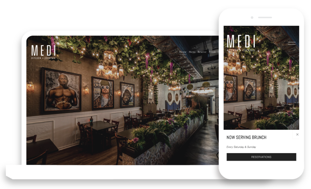
Background
In the dynamic realm of digital design, prioritizing user experience goes hand-in-hand with ensuring inclusivity and accessibility for diverse audiences. In pursuit of this commitment, a thorough accessibility audit was recently conducted on the Medi Kitchen website, a Mediterranean restaurant located in Chicago.
This audit, conducted in accordance with Web Content Accessibility Guidelines (WCAG) standards at levels A and AA, examined various aspects of the website’s design, functionality, and content. By adhering to these established standards, the audit not only aims to evaluate the current accessibility status of the Medi Kitchen site but also offers realistic solutions to crafting digital experiences that are universally accessible and user-centric.
Findings Summary
This website has clear navigation and successful features, such as consistently underlined links and a primary “Skip to Content” bypass block that enhance accessibility. However, there are some elements that this website can modify further to improve accessibility.
Primarily, creating clear, descriptive alternative text for meaningful photos will help users utilizing screen readers to understand the content. In addition, the menu page has images of text that are not read by screen readers and skipped entirely for keyboard users. This section requires an alternative form of accessing the menu information to be compliant. There are also programmatic errors, such as the email and phone links in the global footer being broken into separate hyperlinks and no H1 found on the homepage. Finally, there are some color combinations found in the global navigation, form fields, and menu images that do not meet the minimum color contrast requirements.
Methods Used
- Test took place on the Chrome browser.
- VoiceOver and JAWS were used as screen reader.
- Color Contrast Analyzer was used to test color contrast.
- ANDI tool and Text Spacing Bookmarklet were also used for testing.
Key Findings
Below are some of the main issues found on the site and ways to fix them
1.1.1 Non-text Content
Problem: Site should have every element devoid of text that is presented to the user include a corresponding text alternative that serves an equivalent purpose.
- PDFs found on page, Menu, had alternative text assigned to null although they were images of text
- Photos on Private Events were text file names, for example G123.jpg
- Alternative text was not assigned for any of the photos found on page, Gallery
Solution: Site should assign alternative text for every meaningful, non-text element and null alternative text for non-meaningful elements.
- For Menu, assign alternative text to read menu content. Alternatively, developers could replace PDF content with HTML
- Each photo on Gallery and Private Events should be assigned descriptive alternative text
1.3.1 Info and Relationships
Problem: Information, structure, and relationships conveyed through presentation can be programmatically determined or are available in text.
- Form on Private Events has every field read by screen reader twice
- In the global footer, links for phone number and email are incorrectly coded. The links are broken up, so they are read as 5 separate links instead of 2 (one for phone number, one for email)
Solution: Site should ensure all text content is developed so users utilizing a screen reader can understand the content structure and relationships.
- For Private Events, hidden code should be deleted
- In global footer, each link should be coded as one line, instead of broken in multiple sections
2.4.5 Multiple Ways
Problem: Multiple methods exist to find a web page within a set of web pages
- The only way to access pages in website is through the main menu
Solution: Site should include a sitemap or search to allow users to access content in more than one way.
1.4.10 Reflow
Problem: Site should be able to be resized at 400% without loss of functionality or the need to horizontally scroll.
- Globally, most images become blurry at 400%, especially on Menu page
- When site is resized, menu scroll area becomes very small, almost unusable (See video example below)
Solution: Ensure site can be properly resized to 400%
- Globally, images should be increased in quality
- For menu, padding should be decreased to allow for resizing
What I Learned
Automatic audits can’t catch everything: While automatic auditors such as WAVE or Axe Monitor can be helpful, they can’t catch every fault of a website. For example, criteria such as 2.1.1 Keyboard cannot be accurately tested without a manual audit. Therefore, it is essential to perform manual audits to ensure all accessibility criteria are met.
