Designing Clarity in a Ticket Transfer Flow
Role: UX / Interaction Designer (Contract)
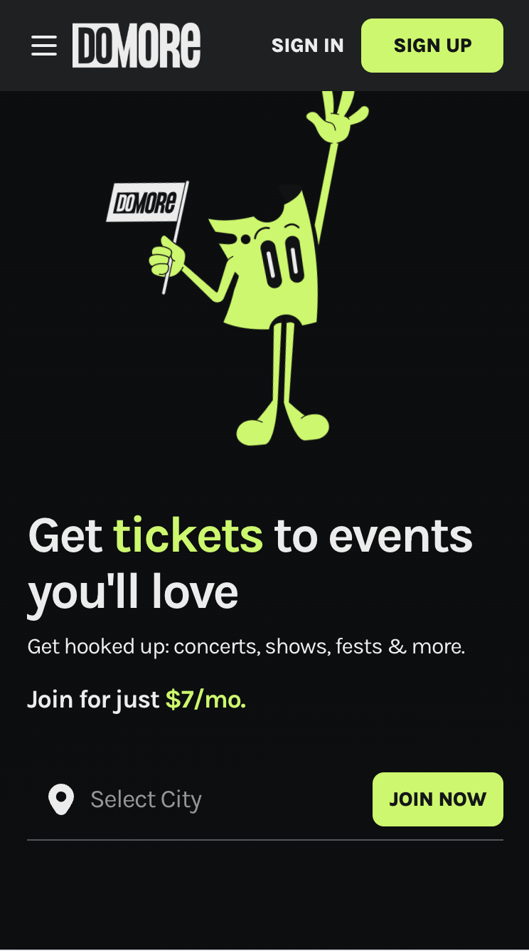
Platform: Web-based subscription product
Focus: Ticket transfer & recipient experience
In this case study
Overview
This project focused on improving the ticket transfer experience for a subscription-based event platform. While the core functionality existed, users frequently misunderstood how transfers worked, leading to hesitation, confusion, and unnecessary support requests.
I redesigned the transfer flow, clarifying expectations for both senders and recipients and improving the overall interaction without changing underlying business logic.
The Problem
Users attempting to transfer tickets and users accepting tickets were unclear about:
Whether recipients needed to create an account
What would happen after a transfer was initiated
How recipients would access and use their tickets
This lack of clarity caused users to second-guess the process, abandon transfers, or reach out for support, despite the flow being technically functional.
Constraints
Existing backend and transfer logic could not change
Flow needed to work for both account holders and non-account holders
Limited engineering bandwidth
Utilize design system to seamlessly integrate with current experience
Current Experience Breakdown
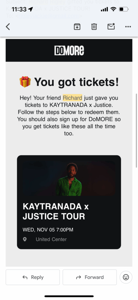
First Scroll
- Headline: User learns they got tickets.
- Paragraph: User sees who the tickets are from, what they’re for, and a note telling them to follow the steps below to redeem tickets.
- Concert tile: User checks below the paragraph to find the steps, sees the concert tile, and taps it expecting it to show the details they need.
- Post-click: Instead of ticket details, they hit the DoMORE sign-up screen and assume account creation is required to access the gifted tickets. They complete the entire sign-up flow, including payment, only to land somewhere that still doesn’t show the ticket info they were looking for. This leaves them frustrated after entering personal and payment details with no payoff.
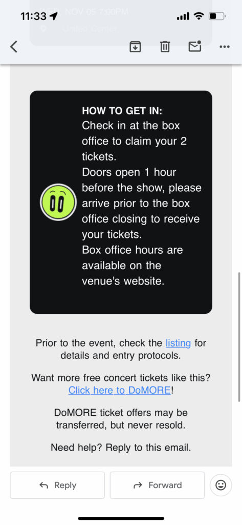
Second Scroll
- Instructions: If the user scrolls as intended, the instructions still feel vague. The box office concept isn’t familiar to new DoMORE users, so they’re left unsure and wondering if the offer is legit.
- Event Details: Additional event details, linked to the DoStuff event listing, are hidden in a sentence below
- DoMORE Sign up: The prompt to sign up for DoMORE is hidden below that, so even if the user wants to sign up based on the information in the first paragraph, they must scroll all the way to the bottom of the page to find out how.
Design Solution
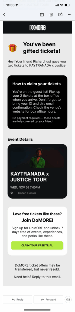
1. Clarifying Intent with Immediate Context
The original transfer experience did not clearly communicate that the ticket had been gifted, leading recipients to worry about payment or hidden requirements.
Change:
I updated the headline to “Gifted” to immediately signal that no purchase or payment was involved. I also shortened the introductory paragraph to surface critical information sooner, reducing the amount of reading required before understanding the context of the ticket.
Impact:
This set the correct mental model upfront and reduced anxiety before users engaged with the rest of the page.
2. Answering the Primary Question As Quickly As Possible
Recipients’ first question was simple: How do I use these tickets? Previously, the answer was buried below secondary content.
Change:
I moved clear, step-by-step instructions into the first scroll, explicitly explaining:
Tickets are picked up at the box office
Only an ID and the emailed confirmation are required
No payment is necessary
I added a short reassurance reinforcing that the ticket was gifted, with a friendly nod to the person who sent it.
Impact:
Users could immediately understand what action to take, what to bring, and what to expect, without scrolling or guessing.
3. Reducing Distraction by Reordering Content
Event details were previously positioned in a way that distracted from the core task of understanding how to attend the event. In addition, the event details were linked to the sign up, causing further confusion.
Change:
I moved event details lower in the hierarchy and linked them to the main DoMORE event listing rather than the subscription sign-up flow.
Impact:
This preserved access to event information while keeping the primary focus on ticket usage, not conversion.
4. Separating Use from Promotion
The transfer experience mixed ticket usage instructions with product promotion, which created confusion and distrust.
Change:
I introduced a clearly separated content block dedicated to promoting DoMORE sign-ups, visually and structurally distinct from the ticket instructions.
Impact:
This allowed users to complete their primary task without friction while still giving the business a clean, appropriate opportunity to introduce the broader platform.
Result
The redesigned transfer experience was approved and implemented. While quantitative metrics were not yet available at the time of this case study, the updated flow significantly improved clarity around ticket ownership, usage, and expectations.
The experience now:
Clearly communicates that tickets are gifted and require no payment
Answers “How do I use these tickets?” within the first scroll
Reduces confusion for non-account holders
Separates core task completion from promotional messaging
These changes aligned the experience with users’ mental models and reduced friction at a high-trust moment in the journey.
View other projects